

The Debian Haskell Group has no proper policy about when to update a certain package to a new version from Hackage. So far, we upgrade when one of us personally needs something, when someone nudges us, if its required as a dependency or just when we feel like it. I was thinking about ways to improve that.
One thing that we should definitely do is to upgrade to new versions that differ only in the forth version number, e.g. from 1.2.3.4 to 1.2.3.5 – these are most likely bug fix uploads and have little risk of breaking things. (Unless they are only changes to the .cabal file, then they might not be an improvement for our users or us.) I plan to code that soon.
But what else can we do? Ideally we’d package versions that will be the newest version for a long time, and not versions that are going to be replaced the next day. Unfortunately, deciding that requires visionary powers. But maybe there is a correlation between the upload history and the lifetime of a new package? Maybe there are patterns, e.g. the first upload after a long time tends to be replaced fast, but the third package in a short succession has a high chance to live long? Can we predict the livetime of a freshly uploaded package? So after a bit of hacking I got this graphic:

It needs a bit explanation: Both axis are time differences, the picture is one year by one year. For every release of which we know the lifetime (i.e. there has been an upload later), we draw its history on a vertical line. The horizontal position of the line corresponds to the lifetime of the release: A package that was superseded immediately later (which I sometimes do after spotting annoying typos) would appear on the far left, a package that is stable for one year on the far right.
The history itself is a series of dots, representing the previous uploads of that package, with their distance from the lower edge indicating the time that has passed since then. So if a package had two updates half a year ago, and then no update for another half year, it would contribute two dots right above each other in the middle of the picture.
Unfortunately, the picture does not yield any insight, besides that short-lived packages are more frequent than long-lived packages.
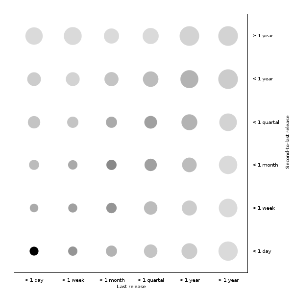
So I tried another view:

I grouped uploads by the livetime of their two preceding uploads. For each such groups, the circle indicates the average livetime. The darkness indicates the absolute number in the sample. So we see a correlation between the packages livetime and the livetime of its predecessor, which is also not very surprising. We can state some hypothesis, like: “A package replacing a very old package is likely to be long-lived if its pre-predecessor lived very long or very shortly, but less so if that lived for a few months.“ But I’m not sure of the significance of these.
I could have also taken into account which uploads are major and which are minor, by looking at the version number, but I didn’t.
What’s the conclusion? Nothing much. I got some funny looking graphs. And there needs to be a way to render pictures like the first within the axes of a Chart diagram. I put the (somewhat hackish) code online – feel free to play with it.
Have something to say? You can post a comment by sending an e-Mail to me at <mail@joachim-breitner.de>, and I will include it here.